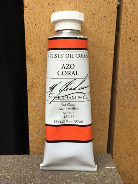
M. Graham & Co. recently released a limited-edition color called Azo Coral. They sent me a free tube to try and I want to pass along my experience with it.
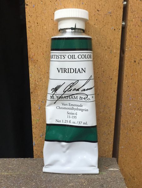
Azo Coral is an exciting semi-transparent color which has an intense red mass tone with an orange undertone. M. Graham’s website suggests that it’s well-suited for use as a thin glazing color or as a thicker body color. I don’t really paint transparent glazes much in my work so I decided to just use it as I normally would, mixing and painting wet-into-wet. Also, for quite a while I had been wanting to experiment with a red/green limited palette. I decided that this was a good chance, using Azo Coral and Viridian plus Titanium White.
This particular limited palette of just two colors plus white gives a pretty good color range since all three primary colors are represented. Yellow and red are present in the Azo Coral and Viridian is a very blue-green. Also, since red and green are complementary colors, some nice grays can be mixed with the addition of white.
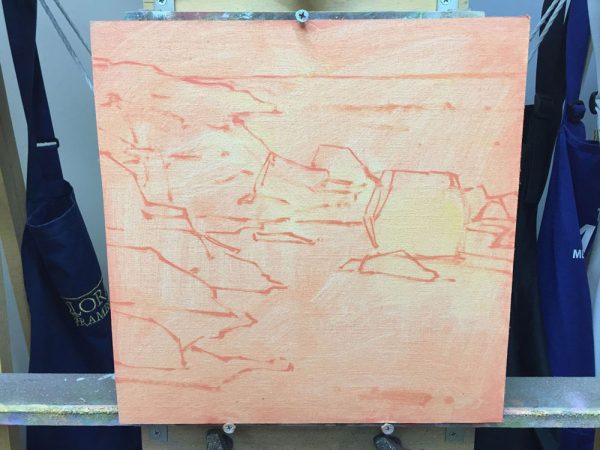
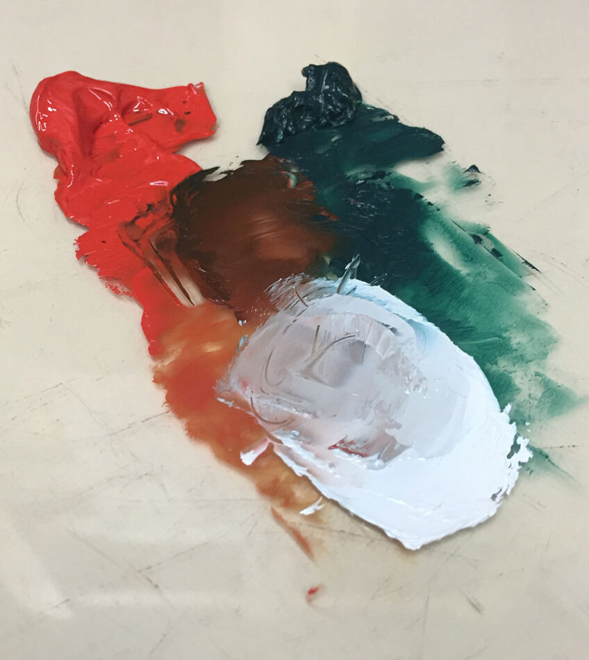
Azo Coral mixed with some white worked beautifully as an initial canvas wash, leaving the canvas a lovely salmon color. I then drew in my scene with a #2 hog bristle brush using Azo Coral mixed with a little white. Note in the photo the yellow-orange undertone of the Azo Coral showing where I wiped to correct a few spots in my drawing.
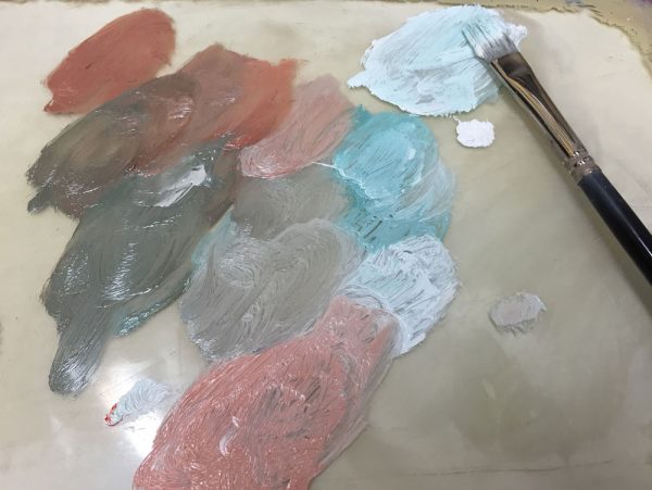
Since Viridian is a transparent color and Azo Coral is semi-transparent, I had to mix slightly larger batches of color in order to paint more opaquely. Adding Titanium White further increased the opacity of the mixtures. As I’ve mentioned before, M. Graham prides themselves on maximizing the amount of pigment in all of their paints, and Azo Coral is no exception. Plenty of pigment and tinting strength.
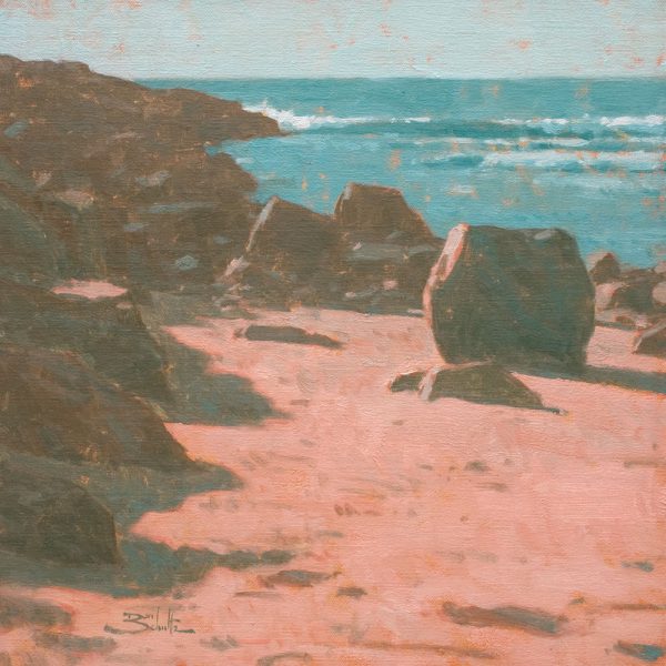
You can see in the photo of my finished painting the believable range of colors produced from this limited palette. The Viridian mixed with white reads as an appropriate color for the water. The interplay of the warm and cool color temperatures in the rock shapes creates plenty of visual information, created by mixing Azo Coral and Viridian together with small amounts of white. The Azo Coral mixed with white created beautiful warm colors for the sand and rocks in the direct sunlight. And the initial color wash peeking through here and there increases the color harmony in the painting and gives the illusion of more detail in the shapes.
All in all, this was a very enjoyable color exploration and a pleasure to try out M. Graham Azo Coral. Thanks to Art, Diana and everyone at M. Graham & Co.!
8 Responses
TeresaMaria
Dan, thanks for this lesson and introducing us to a new color. An intriguing post on the versatility of a limited palette.
Stefan Ullrich
Hi Dan,
wow great painting, congratulation! The glowing of the sunlight area is so amazing.
The paint seems to have a high saturation of pigments. Do you see differences to other brands you use?
Thanks for your critique you sent me. It was very helpful.
Stef
Kay Zetlmaier
Thanks Dan. I love using a limited pallet as I used in your Portrait workshop. This Azo Coral is yummy!
Rob Impellizzeri
Dan – I appreciate the way you experiment and push boundaries. It helps everyone grow and your generosity is evident. Can you discuss your solution for creating transparent shadows, since adding white to the Azo Coral and Viridian mix would, as you point out, increase opacity. Great job and thanks!
Rob
Lynn Davis-Smith
That looks like a beautiful color, Dan — coral, right up my alley! Can you tell us what pigments are in the Azo Coral? I love exploring pigments… Thanks for sharing your knowledge.
Dan Schultz
Thanks for your comments, everyone. Stefan: I have seen a difference in the M. Graham paint vs. other brands. I recently started some color charts to compare brands and as I tinted each color with Titanium White to match them visually on my charts, I noticed that the Graham paint consistently showed better tinting strength. In other words, I had to use a greater amount of paint for each color from other brands to match the saturation of each Graham color.
Dan Schultz
Thanks, Rob. For this painting, I didn’t really try to paint transparent shadows. Instead, I tried to be strategic about leaving some of my initial wash color showing through between some of my brush strokes as I added paint. That creates a sense of transparency. You should be able to see what I mean in some of the closeups of the painting at the following link.
http://www.danschultzfineart.com/images/artwork/landscapes/lhtml/breakwater.html
But with less white added and some mineral spirits, you can still achieve some actual transparency of the paint.
Dan Schultz
Lynn: Azo Coral’s pigments on the label are Benzimidazolone and Diketo Pyrrolopyrrol (PO62 and PR254). Say that five times fast.